Windows 11
November 7, 2021
Windows 11 Start
Microsoft released a new version of Windows on October 5th of 2021. Despite all of the hype, I did not think that I would try it until some time in 2022 due to a slower rollout across all devices that could support it. Imagine my surprise when I got the upgrade option on October 26th . I did not plan on upgrading right away because of some of the troubles I had heard about from Youtubers like Linus from Linus Tech Tips. I had heard about the issues with graphics cards suffering from a performance drop due to VRB. However, once I got the upgrade option, I did a little research to see if the issue was something I should really worry about, or if here was a solution. It turned out that if I was upgrading from Windows 10, the VRB option would be off by default, so I would not see the performance hit. Since my laptop was primarily used for gaming, this would be a deal breaker for me.
Once I got past the concerns about performance, I started the upgrade. The upgrade took about an hour to complete, with at least one restart of the system that I could remember. The download of the upgrade initially looked like it would take very little time, and it was ready to install; I was pleasantly hopeful. However, after it looked like it was installing, it switched back to downloading, and I knew I was in for the long haul. Outside of that though, the upgrade process was about the same as upgrading Windows 10 versions. I could continue to use my computer while the new operating system downloaded in the background.
User Interface
So the first thing that most will notice is the new wallpaper and the new taskbar layout. The wallpaper is great. I downloaded it for my work computer, which is still on Windows 10. It is simple and immediately recognizable. The taskbar change is also great, though it is a little unbalanced. With the icons moved into the middle, but the system tray still at the far right, the left side is now empty and it feels a little off balance. This is a minor thing, and there are far more elements about the user interface that annoy me more. Also, there is an option to move the start menu and icons back to the left, if you so choose.
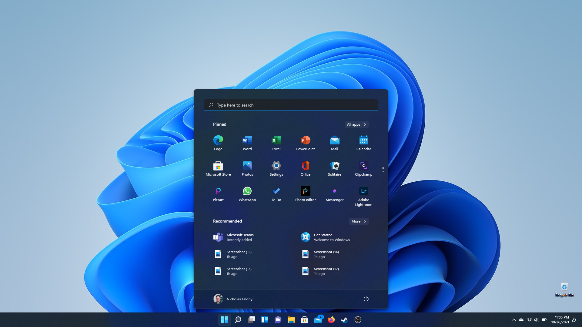
The new Start Menu looks refreshed and I like it. It has a nice, frosted look and hovers above the Taskbar. The simple combination of favorite applications and recommended items is welcome over the live tiles. However, the recommended section, right out of a clean upgrade, is giving me recommendations of Teams, an application I have never used on my personal laptop and do not see a reason to. I see this being a place for Microsoft to ‘recommend’ their applications to me, along with recently opened files. In addition, the pinned applications section came bogged down with a ton of crapware games and application suggestions I do not want. About half of the pinned applications were ones I did not even have installed. I spent time removing all of these applications from the system. Fortunately, most of them were not technically installed. Even though this was an upgrade, it felt more like a fresh install, and not in the good kind of way.
On a side note, I had to stretch and fill the pinned application section with anything I thought I might use because if it is not filled, the space does not adjust. It just has empty space where the application icons would go. I also notice that settings needs to be a pinned application as the dedicated button on the start menu is gone.
Another change visible before opening anything in the system are the new icons. Microsoft has rolled out updated icons across the system and they look modern and colorful. What is more, the icons seem to be more consistent across the system on first-party applications. Windows 10 still had icons from Windows 7 for applications like Notepad. Even the icons in Control Panel, which is still in Windows 11, look updated. Having a consistent icon theme throughout the operating system is an important part of making the system feel cohesive. It is nice to see that Microsoft thought about this element.
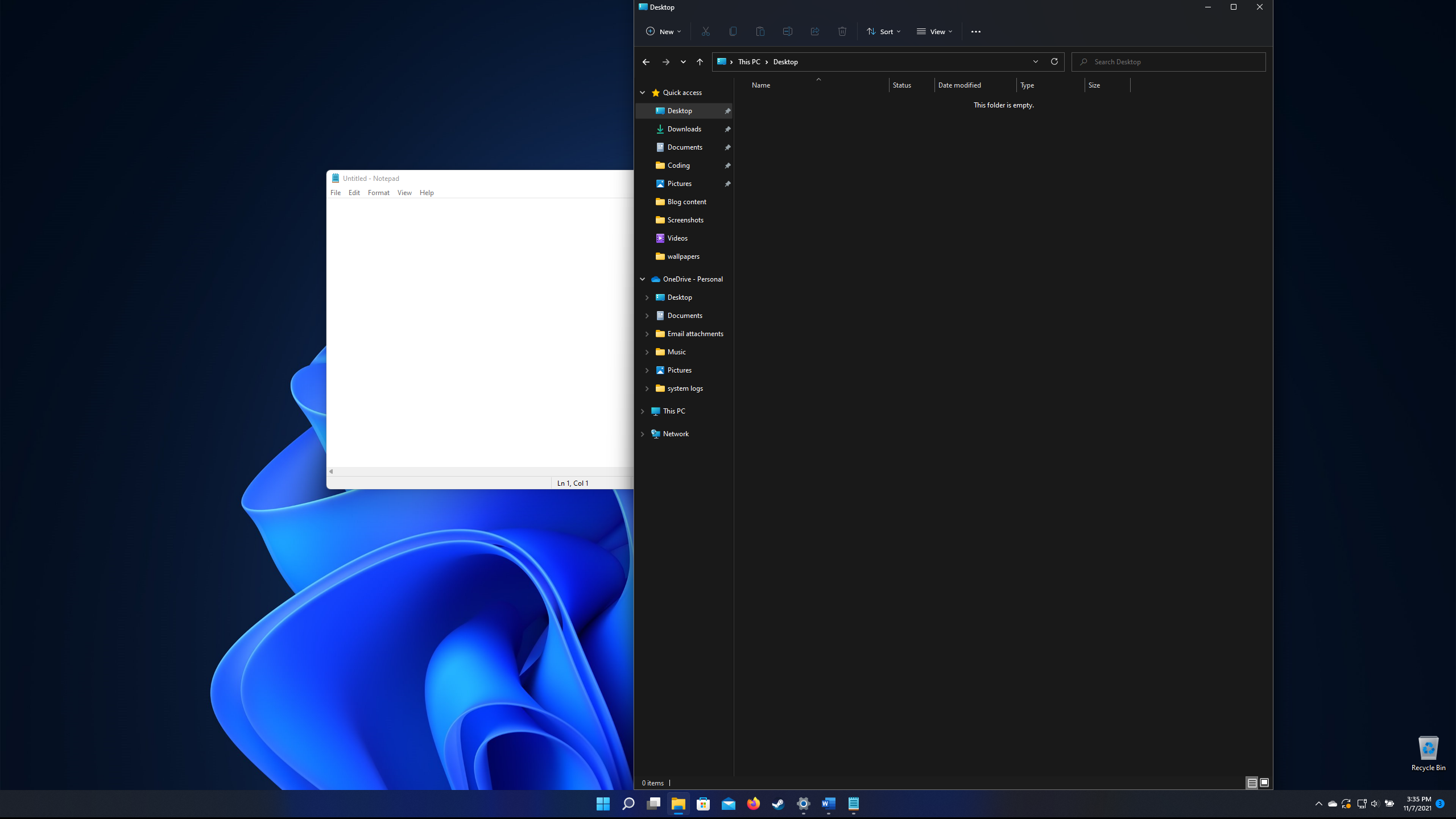
Much to my enjoyment, File Explorer got some love in this update. It now has a more modern look and finally got some of the frosted translucency that the rest of the operating system has, making it fit in a little better. It no longer looks like it is an afterthought within the system, which is good because I happen to look at file explorer a lot. The refresh is long overdue and something that I have wanted for a long time.

Windows 11 File Explorer
Of course, there are the rounded corners. The windows have rounded corners, and this is done throughout the entire system. While this is a nice change for Windows, it copies what is already done in Linux distributions and MacOS. Good on Microsoft for catching up, but since this look has been used for so long on other operating systems, will they move on while Windows sticks with this look for another five to seven years?
Enough of what I like about the visual refresh. There are still some major inconsistencies within Windows 11. One minor one is the way the translucency works. Even though a window with translucency may overlap another window, the translucent part seems to reflect the background as though the window was not there. This worked properly in Windows 7 and Windows Vista, so I am unsure why they did not get it correct here, but they did not.
Despite being on top of another window, the translucency appears to show straight through to the desktop.
And then there are the menus. Windows 11 refreshed a lot of the context menus throughout the system, and they look great. They have the same frosted translucency with a consistent highlight on what the cursor is hovering over. However, the context menus are inconsistent throughout. Some of the older, legacy context menus lack the translucency and rather than the soft, gray highlight, they have a blue highlight. What is more, the highlight lacks any kind of padding, giving it a cramped feel. There also seems to be a slight animation where the gray highlight fades in and out, but the blue highlight appears to lack this same animation. While all of this is trivial, it takes away from the feeling of overall cohesiveness for the system.
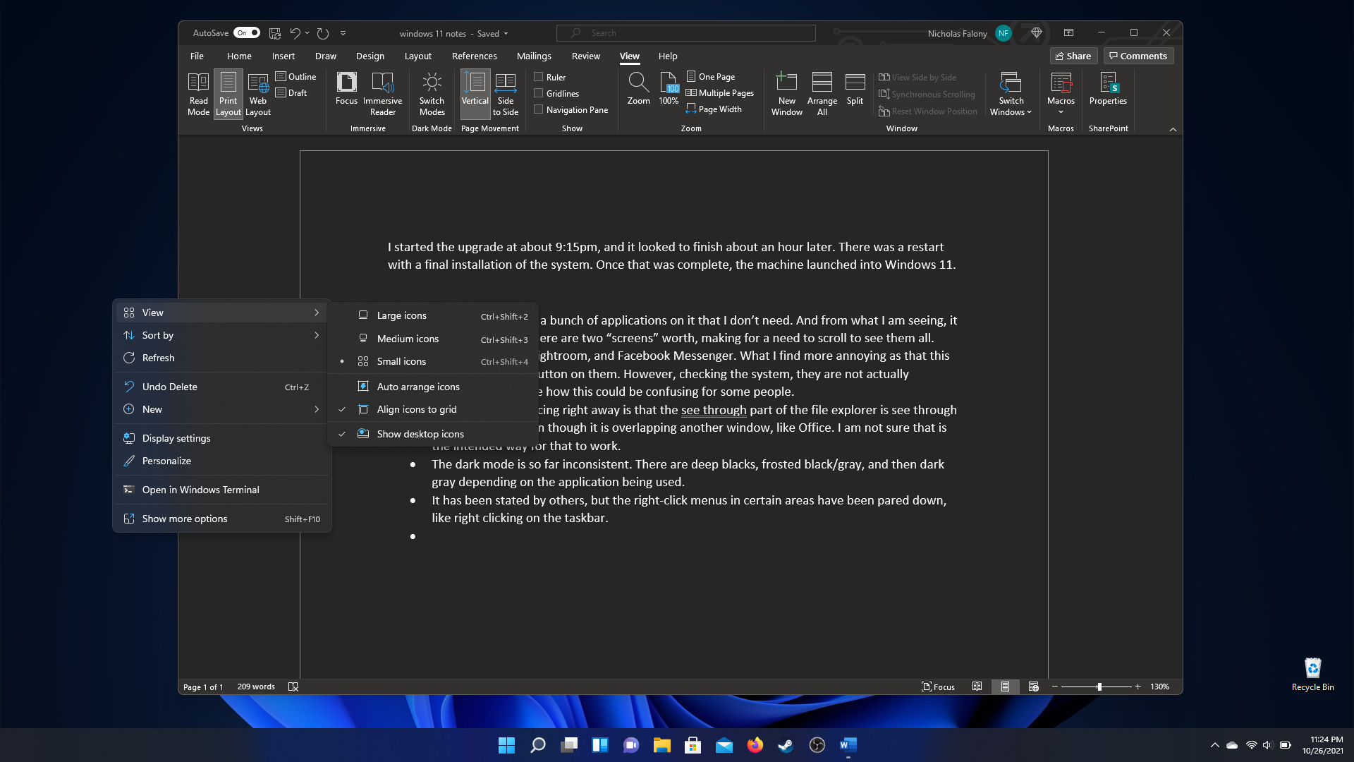
Here is an updated menu with the new look.
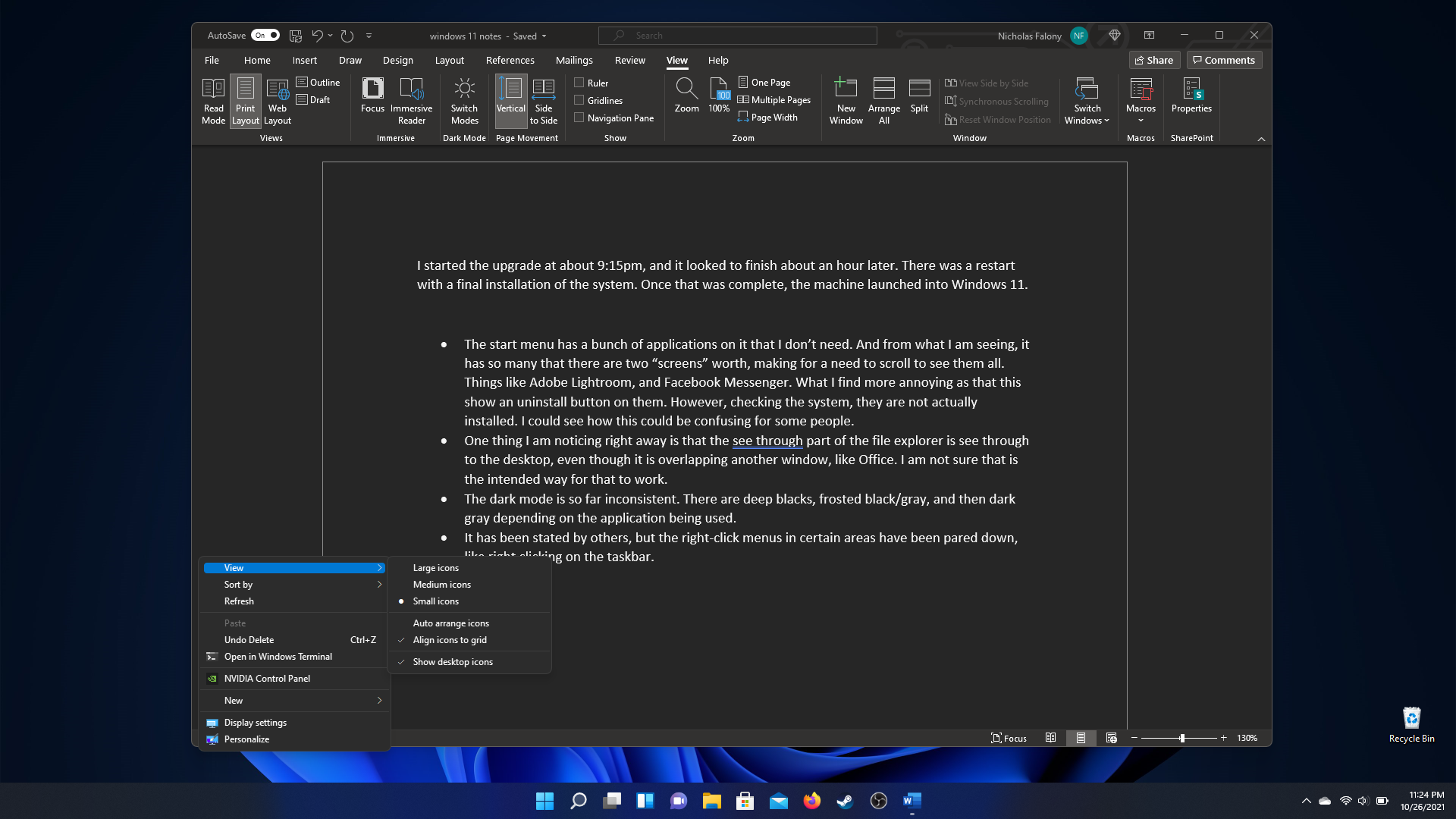
Notice that the legacy menus have a different highlight, no translucency, and lack of padding around the highlight.
Something that I noticed while writing this article while on my Windows device is an inconsistency in the translucent effect. While I have a window in the primary monitor, such as File Explorer, the translucent effect works, but it does not work on the secondary monitor. When I discovered this, I had my laptop hooked up to my gaming monitor. gaming monitor was the primary monitor, an the laptop monitor was secondary. When I attempted to do a screen shot, it looedlike the translucency was working, so unsure what could be causing it to not look that way while using the computer.
Office, of course, does not respect the dark mode unless told to do so, and then it uses the deep black it has been usng now for several years. I also noticed that the refreshed rounded corners return to the sharp ones from Winows 10 the moment that you have a wndow stretched from top to bottom of the screen. I am guessing it works better when tiling windows around the screen, but seems a lttle off when it is a window by itself
Rounded corners disapear and applications like NotePad do not respect dark mode.
There are many things in here, but I will gripe about one more thing. There are still elements that do not respect dark mode. Tool tips, pop-up menus and alerts, even applications like Note Pad. Unlike MacOS and Linux distributions like Ubuntu, Windows does not seem to be able to nail dark mode. It is pervasive enough that I still prefer t use it and even think it looks good. It just bothers me when the random Microsoft Office tool window pops up and is stark white like a slightly refreshed version of the same window we saw in Windows XP. Windows 11 is Windows 10.
Windows 11 is Windows 10
For everything that I wrote on the user interface, the rest has been smooth sailing. All of my games are still installed and work great. I experienced no performance hit on the games that I play. I admit that they are all older games, but they still run smoothly.
For some reason the syncing with my OneDrive storage was switched off, but that was a simple click to start it back up again. OneDrive and the syncing between my Windows, Linux, and mobile devices as been one of the features I like the most. Its integration with Windows, and being able to access the files through File Explorer and open in the Office applications is convienient. This article has been written in part through the Office Online web application and on my Windows laptop with the Office Word application. All of the screen shots I have taken immediately save to the OneDrive storage, and are immediately accessable to use through the web.
Windows 11 really feels like Windows 10 with a fresh coat of paint. There are some items under the hood which makes Windows 11 different. One of those items is support for hardware. My desktop processor is not supported on Windows 11 and has switched over to Linux. There is nothing wrong with the processor specifically, and it is powerful enough to run Windows 11, it is a Ryzen 1800X. My understanding is that Microsoft made the decisions based on vulnerabilities in earlier generation processors, and possible error with earlier hardware working with Windows 11. Windows 11 also requires TPM 2.0, which my desktop does not have. I could get a module for an earlier version of TPM, but that costs money and is uneccessary. Suffice to say, I have one computer that will be running Windows 11.
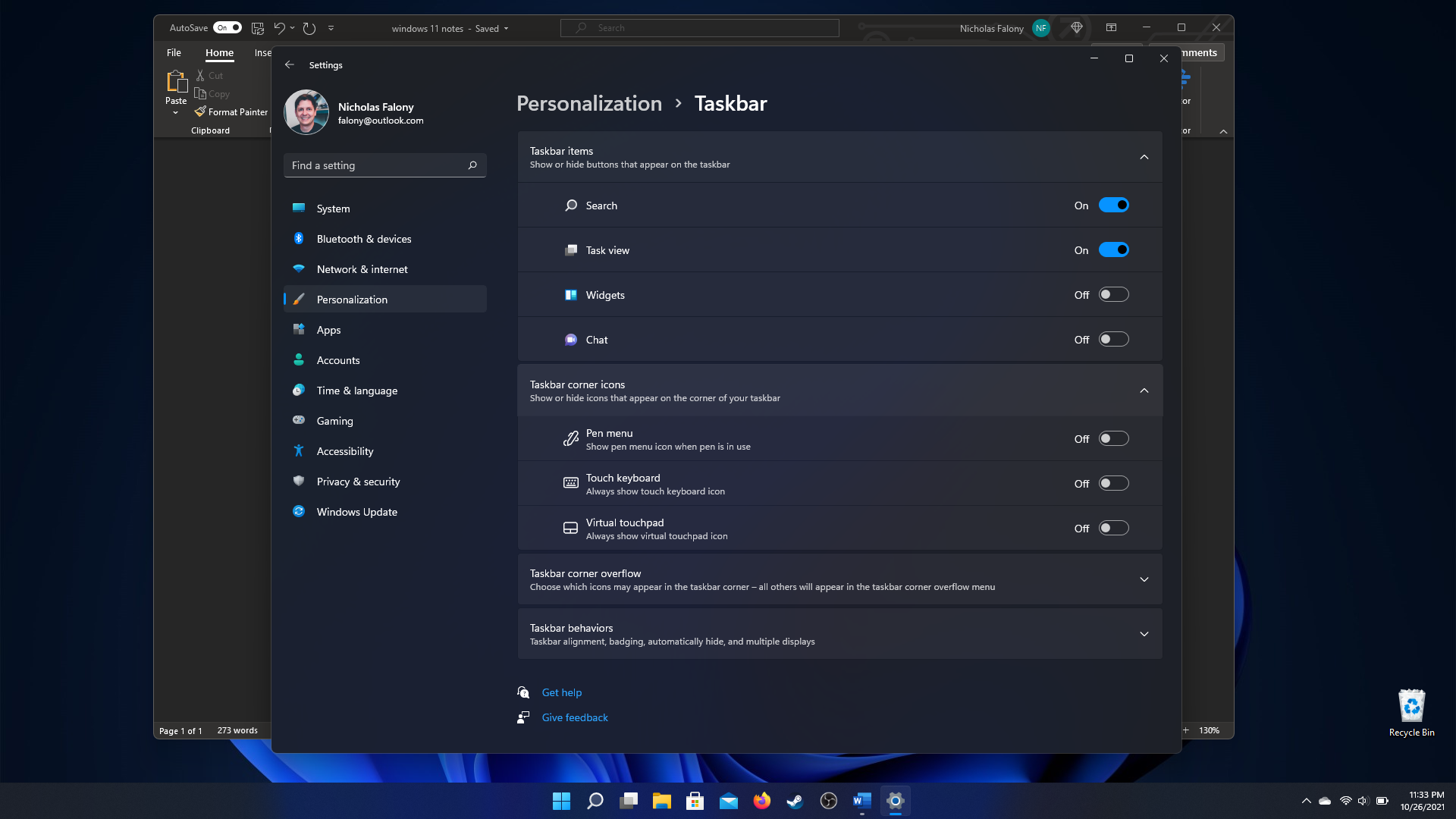
One final note is privacy. Windows 10 is not the best when it comes to privacy. There are advertisements built into the operating system, and by default uses a unique advertising ID to tailor ads for the user. There is also a lot of telemetry data that is sent back to Microsoft on how you use your system. Well, this will continue in windows 11. One of the first things that I checked after the upgrade were the privacy settings, and wouldn’t you know it, they were all set back to default, meaning the OS would send all the data it wants to. I had to switch everything off again, knowing that it only stops so much. I dislike that Microsoft does this. I get the telemetry, though I dislike that there is some level of it that cannot be shut off, but at least the company could respect my prior settings. But they did not.
Final Thoughts
There are a lot of parts of Windows 11 I do not get to try out. I do not have a Surface device, or any Windows computer with a touch screen. But from what I have experienced, it is Windows 10 with a fresh coat of paint. And while that fresh coat of paint makes it look great on the surface, they forgot to paint some of the less used parts. Coming from an upgrade, almost everything carried over and just worked, but there were some things, such as privacy settings, that did not carry over.
Do not get me wrong, I do like Windows 11. It works well and looks good. But once you start using the system, the initial look-and-feel improvements wear off, and you start to see all the little UI paper cuts that make Windows frustrating when you hold it up next to something like a MacOS.
Telemetry and advertising are still part of the operating system, which will continue to keep me from wanting to use this system for more than gaming.