macOS: Big Sur
November 29, 2020
Apple recently released their new Mac computers with the new M1 chip. Universally, this has been hailed as a step forward in processor technology. Alongside the new Macs, was released the latest version of the macOS, Big Sur. In my experience so far, which is very non-technical, most of the changes are cosmetic, and that is not a bad thing. The system has gotten a visual overhaul and now pulls a lot closer to in line with the design of iOS and iPadOS. Let’s step through some of the refreshes.
macOS: Big Sur Desktop
Right away, you will notice that Apple has done away with the landscape background as the default. While there is a dynamic wallpaper in the options that is of Big Sur, it is not the default. I appreciate the more colorful wallpaper of choice, and so far have stuck with it. It has a night mode version of it as well and looks pretty good.
The next thing that you will notice in Big Sur is the rounding on the corners of just about everything. From the dock at the bottom to the menus, and windows, even the icons, everything got a more rounded treatment in this refresh. It gives the OS a subtle, but fresh look.
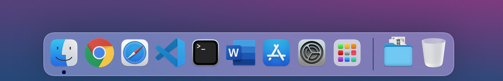
macOS Big Sur Dock
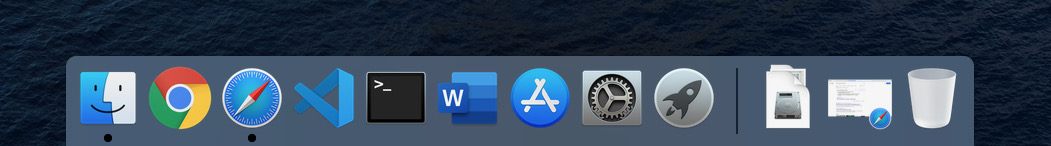
macOS Catalina Dock
iPadOS Dock
You can see in the comparisons that the dock looks a lot more like iOS. I think that this is a good choice, not because I want MacOS to be more like iOS, but because it provides a more consistent experience across devices. If you are someone that happens to live in the Apple ecosystem, then you will have a similar look on all of your devices and applications. It also makes sense with the transition to the M1 ARM APU and iOS applications running natively in macOS.
Another area where the look and feel are more similar is in the quick settings. You can access this by swiping down from the top right corner in iOS and clicking on the icon in the top right corner in MacOS.
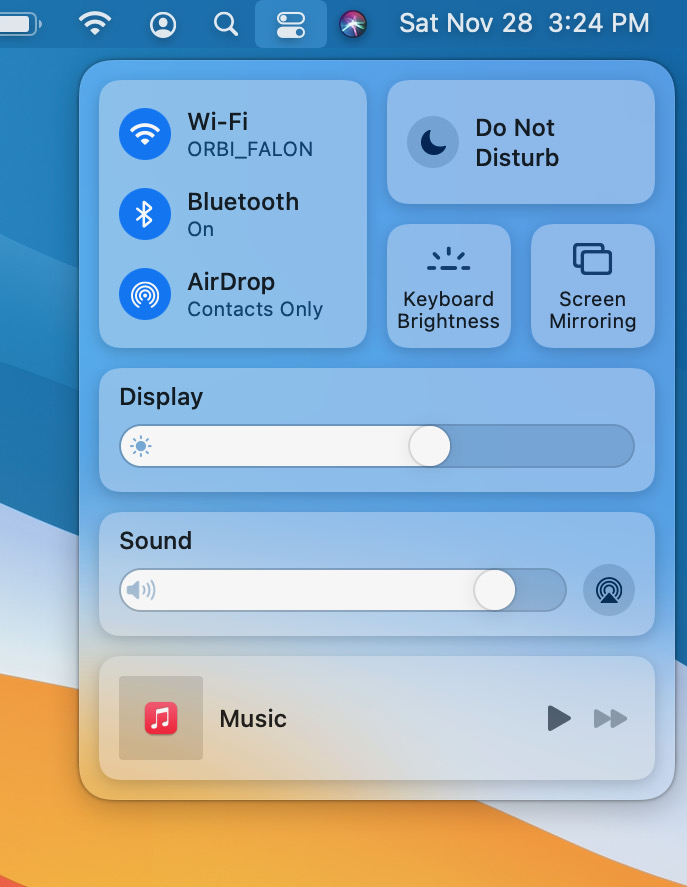
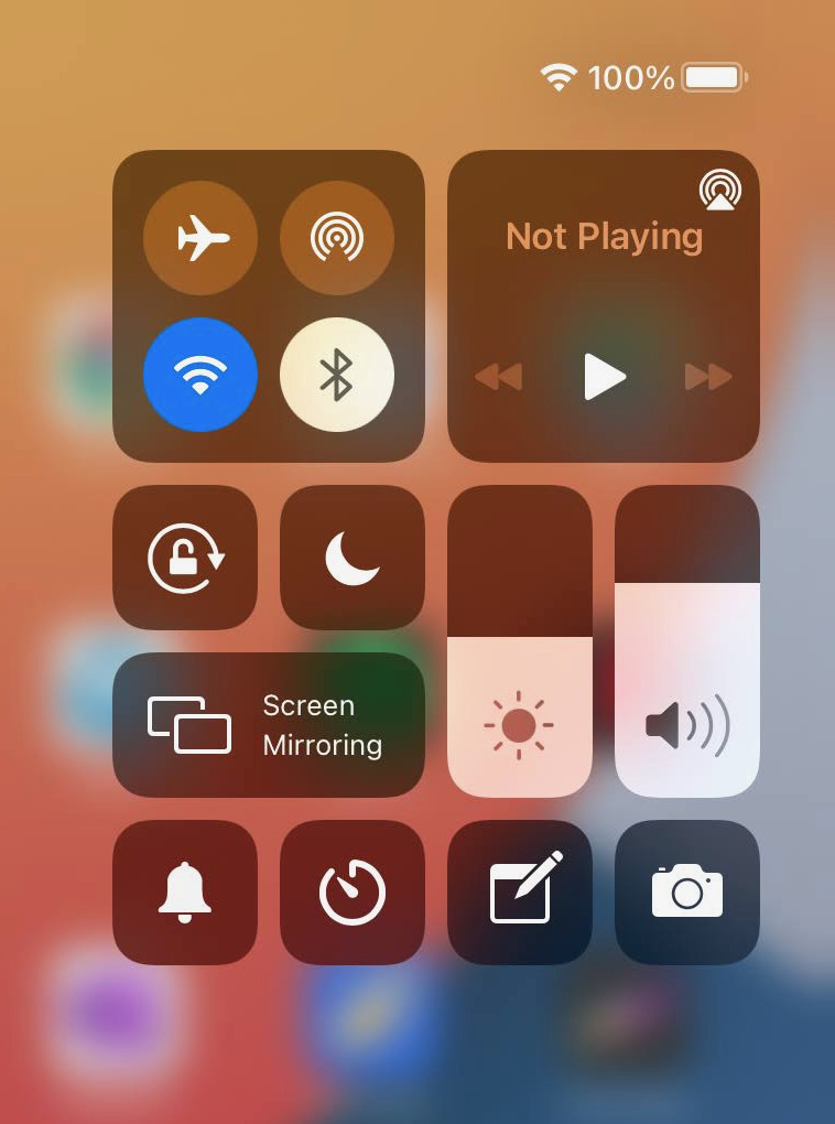
While the options may look different, the design is very similar.
A couple of other design changes that stand out: The menu bar is much more translucent now, rather than just while or dark. Some of the applications also take on a new design, as does the notification and widget section off to the right.
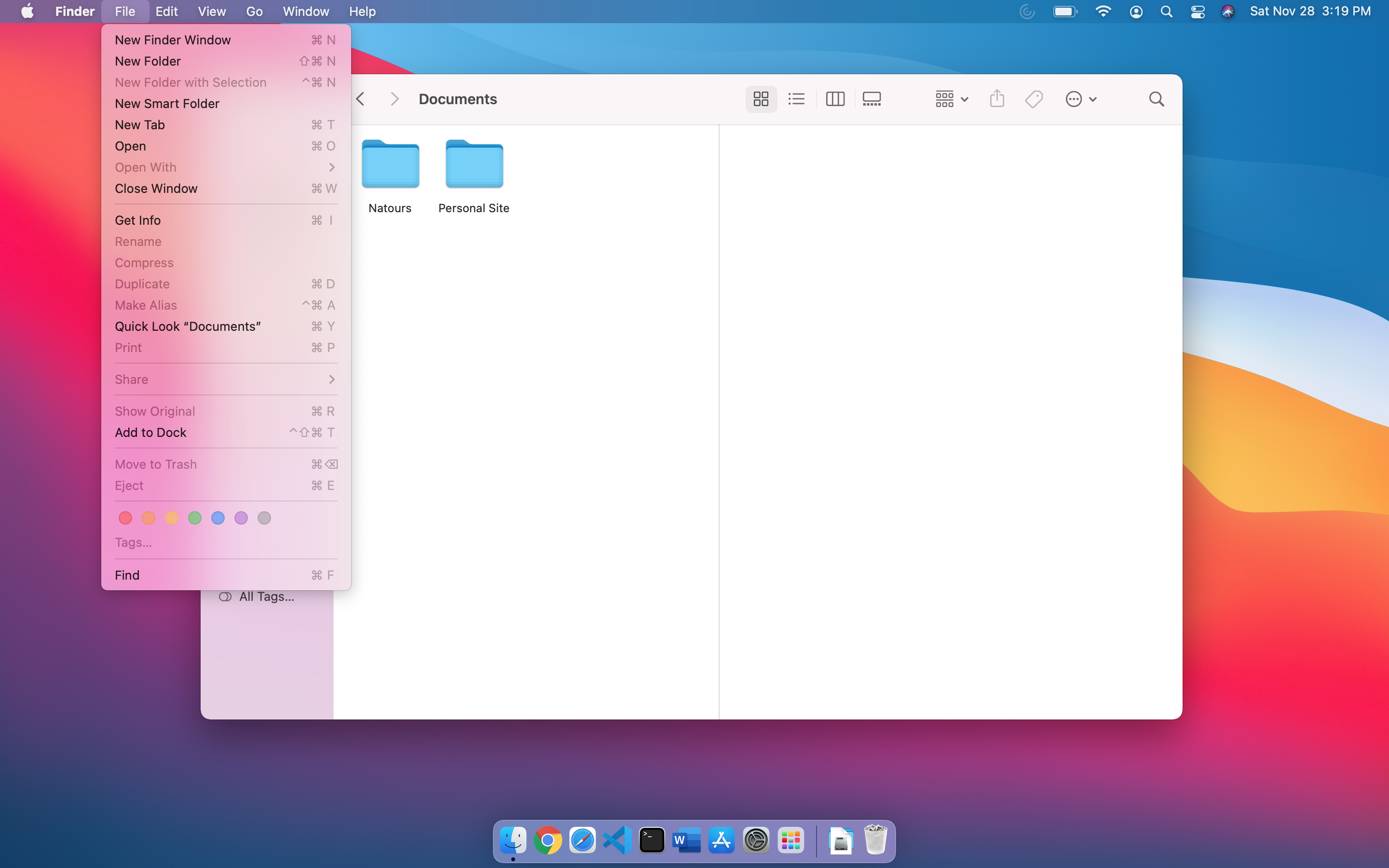
Big Sur Menu
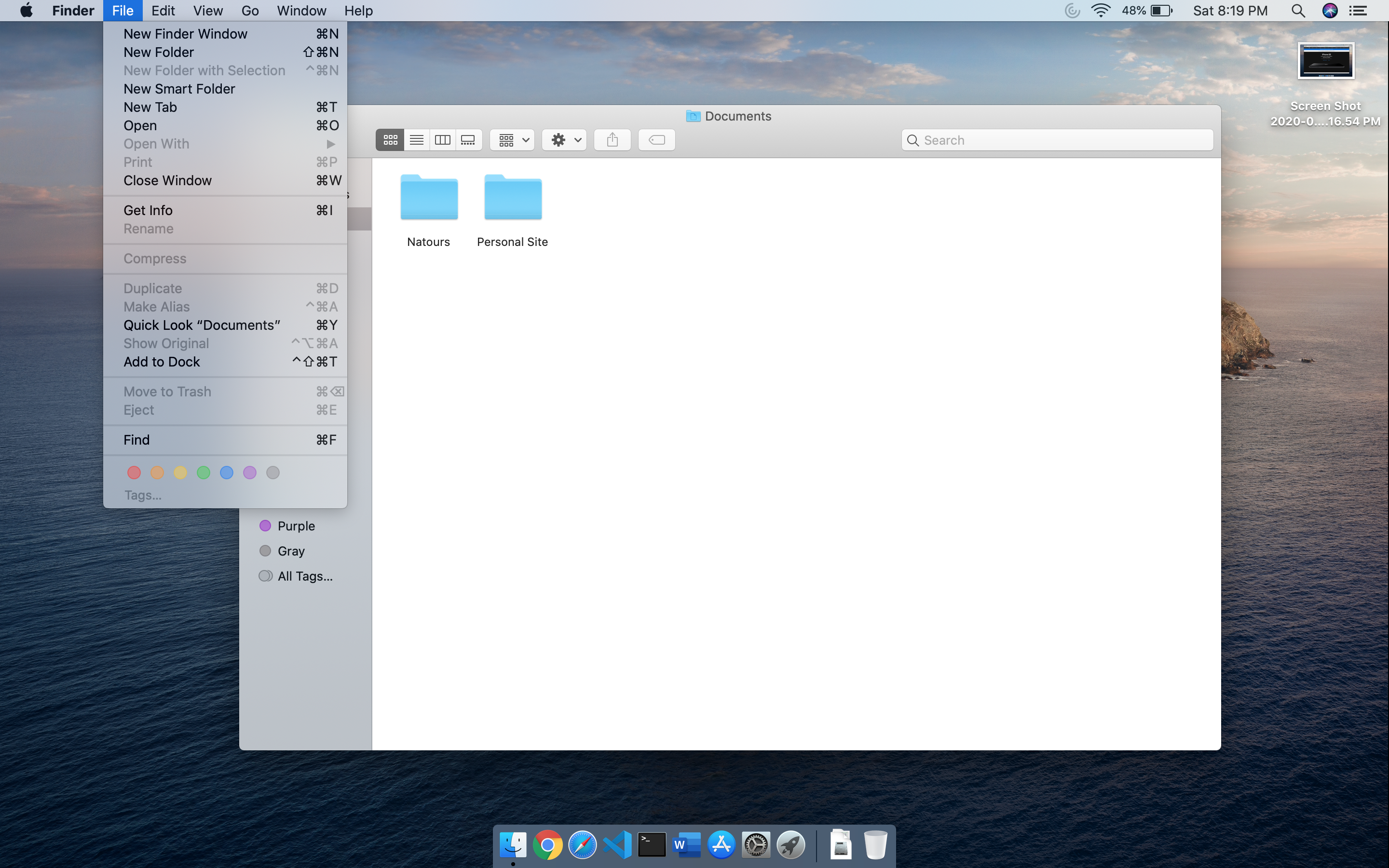
Catalina Menu
Gone is the gray tone on the tool bar at the top and side. Now, Finder is more of a flat white, with translucency added to the left, side panel.
The widget and notifications sections on the right is now more free-floating and got the rounded corner treatment as well. It looks great, though this is something that I mostly ignore. It usually is pulled out by mistake.
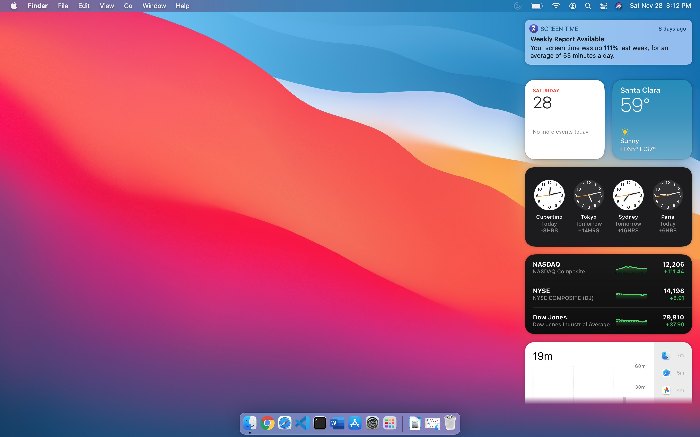
Big Sur Notification Panel
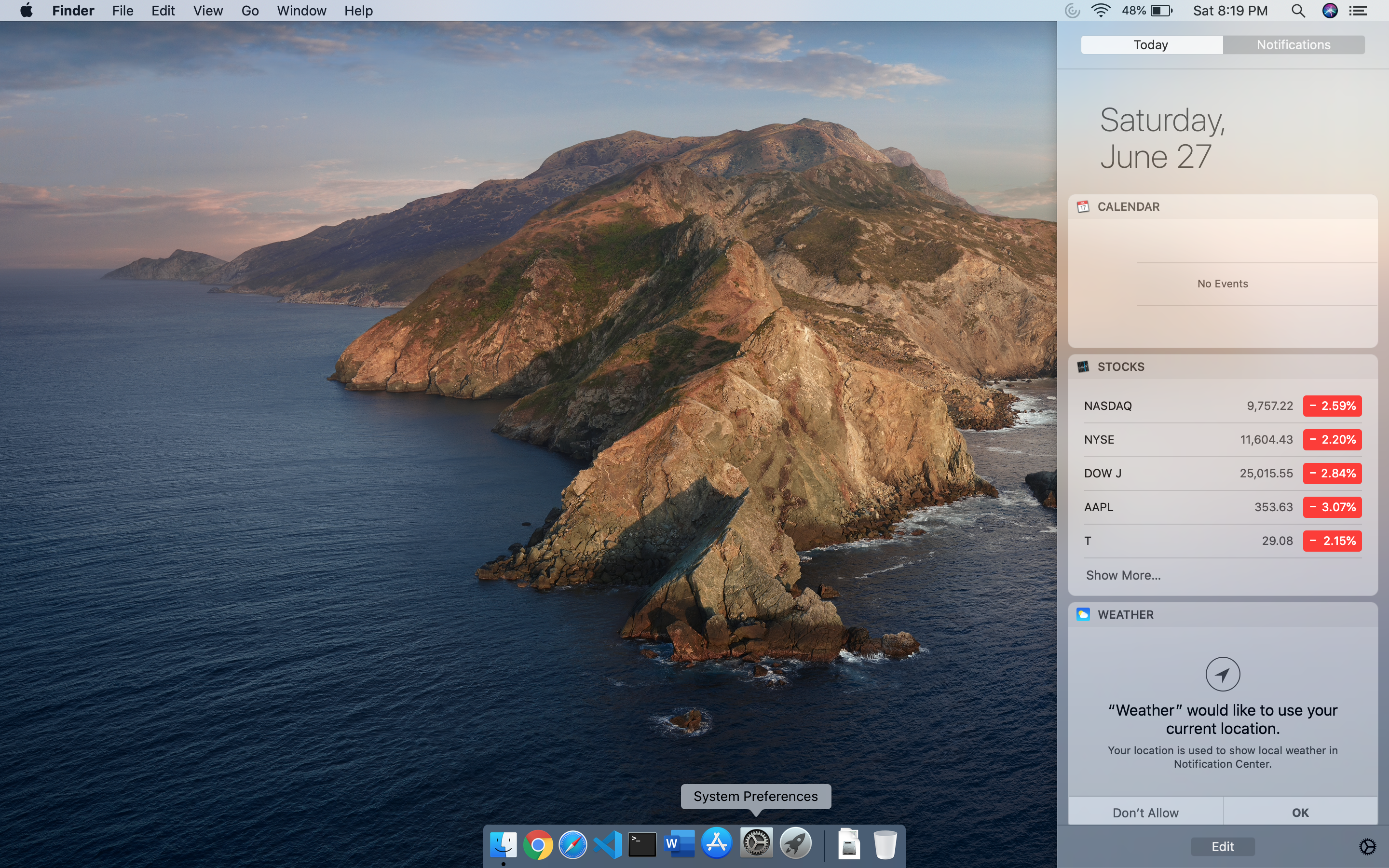
Catalina Notification Panel
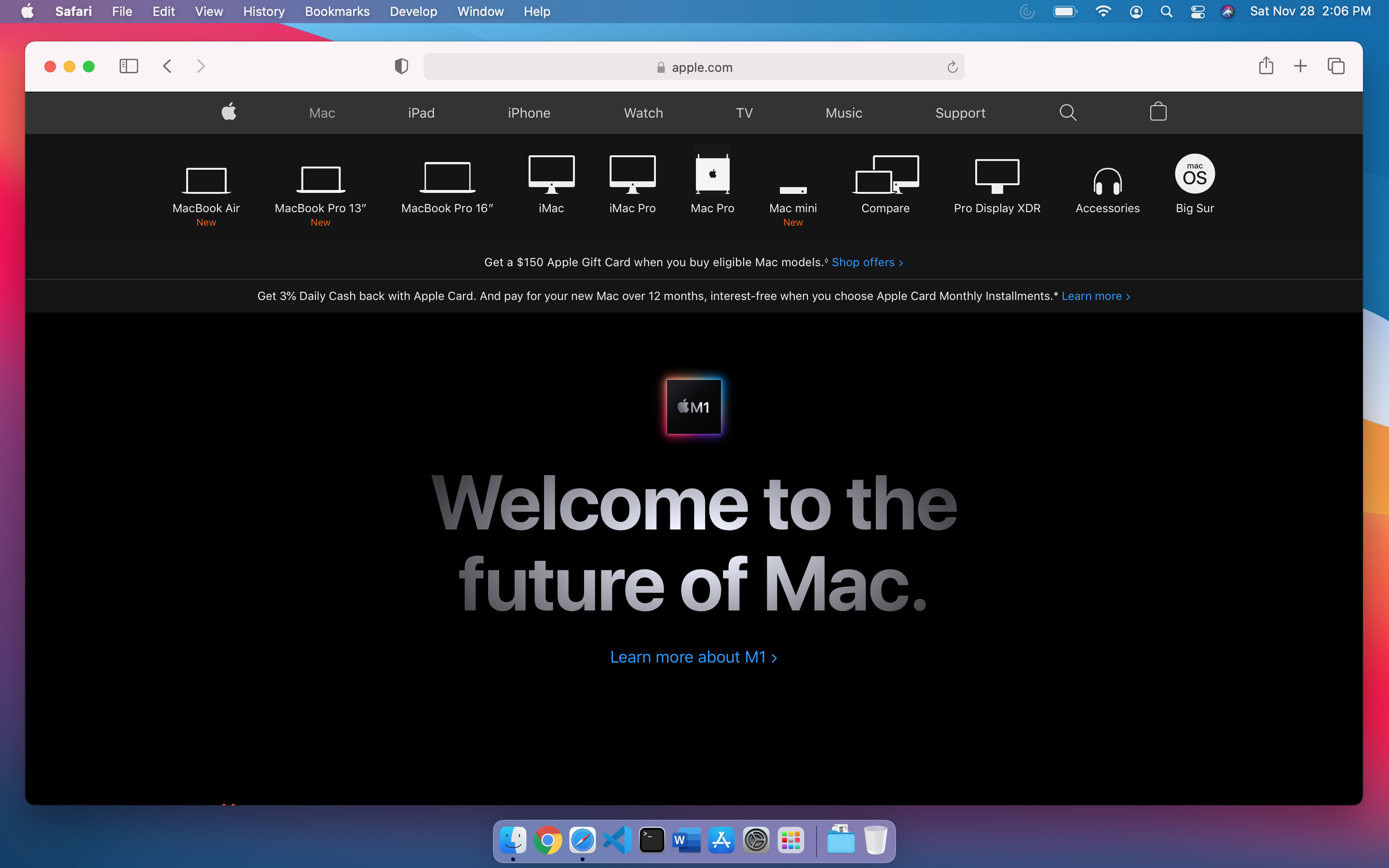
Big Sur Safari
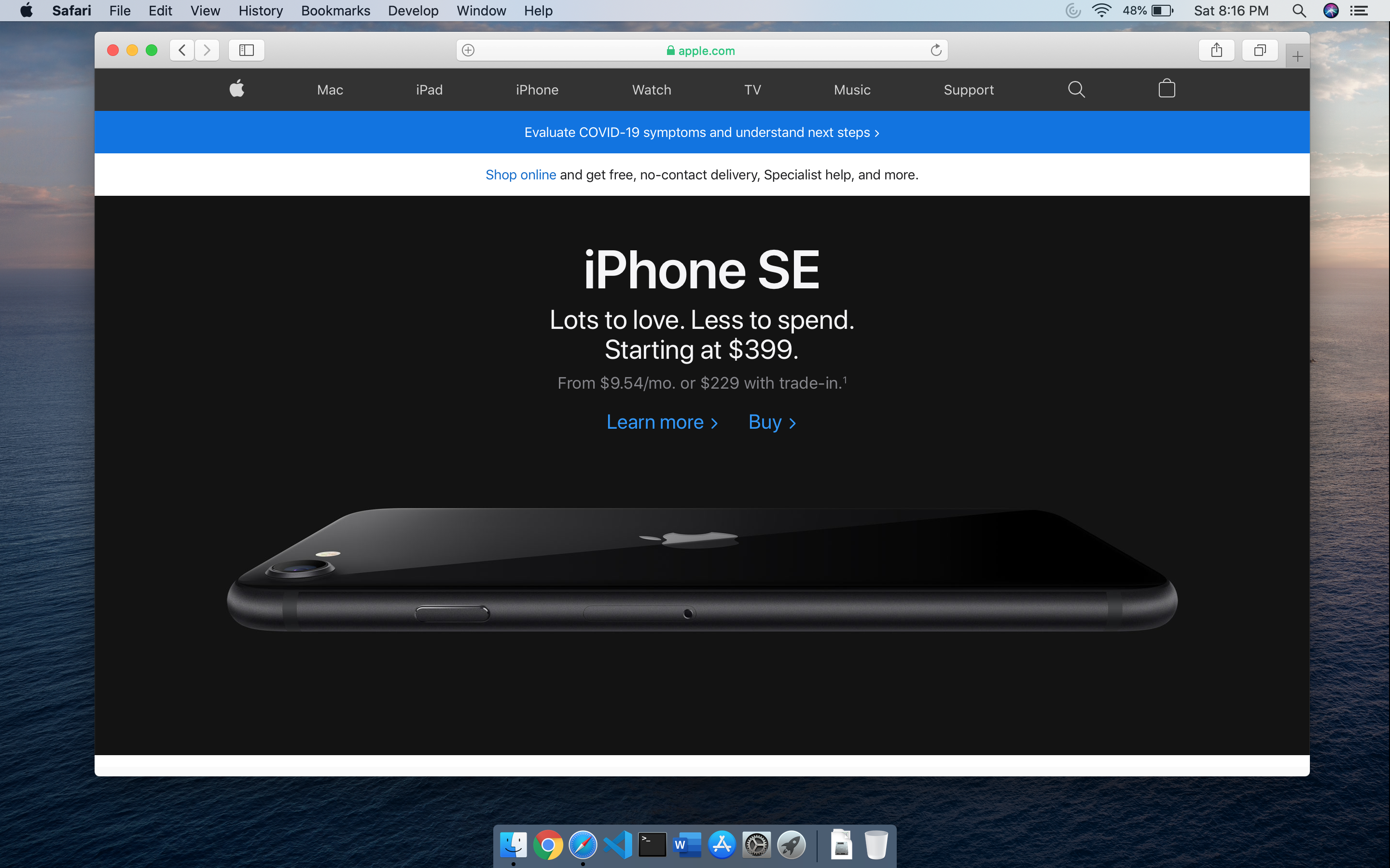
Catalina Safari
Safari is also more white and the title bar looks a little larger.
Overall, the design changes look modern, fresh, and give the OS a great look and feel. I wish Microsoft could be so consistent with Windows. There has not been a place in the OS where I notice things still look older and out of place. Everything got the fresh coat of paint, and the attention to detail shows. I like that there are a lot more dynamic wallpapers, as the dynamic theming is something that I do leave on. Kudos to Apple for another refresh of their OS. I would love to try it on the new M1 silicon, but I am not ready to pony up the dough to get a new Mac just for a backup and testing computer.